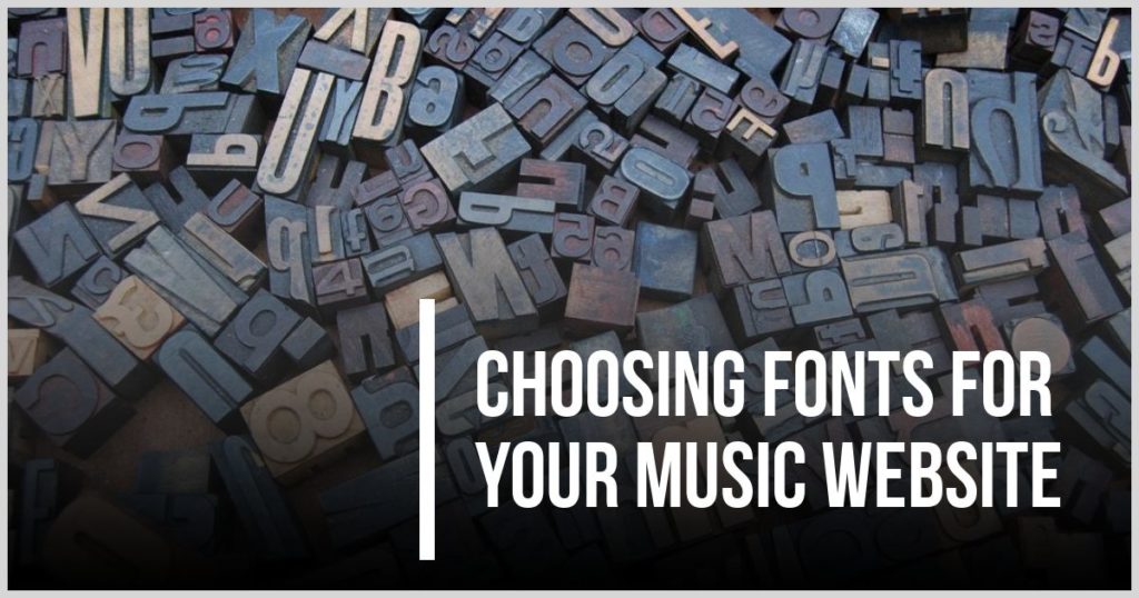
Choosing fonts for your music website
In this article, we will discuss choosing fonts for your music website. You will learn how to work out which fonts go with which, the basic font types, and we will look at some tools to help you choose your fonts.
Why are fonts important?
Choosing your fonts can involve some real pain. Not only are there vast amounts of them to pick from, but not all of them go which each other, some are fancy but hard to read, especially on small devices like phones. They also go a long way into the overall impression that the reader has about your site. Fonts can be serious, fun, functional or fancy. They can help to give an upmarket feel to a brand or make you seem quite the opposite.
This means that choosing the right fonts are crucial. Get it wrong and you can give the wrong impression of your music and brand. You can make your site difficult to read and frighten your readers away before they ever get to read your words.
The way most people do it.
Unfortunately, most people pay no attention to fonts until they accidentally come across the font settings in their site. Then they simply go through every single font, one at a time, previewing the end result. Once they eventually settled on a font for the headings, the whole process is repeated with the main text font. It is a very hit and miss method that takes hours and most people give up before they get halfway through the available selection of fonts.
Don’t do this. It will only waste your time and frustrate you as well as turning out a “second-best” version of your website.
The better way to choose your fonts.
- Here is a great “crash-course” on font styles and types. It explains terms like serif, sans-serif, script etc. https://www.jotform.com/blog/a-crash-course-in-typography-the-basics-of-type/
- Look for inspiration on sites like http://typ.io/tags/music, https://fontpair.co/ and https://www.pinterest.com.au/pin/167266573643027411
- Use a tool like https://fontjoy.com/ which can generate random collections or you can enter a main font and see what it suggests as the other fonts.
- Find a site you like the look of and use a tool like Fontanello to find out what fonts it uses. https://chrome.google.com/webstore/detail/fontanello/jdlhfjlpaijjhklfadlhbbmpjfddkglc
Do’s and Don’ts
Unless you are experienced in typography then your best bet is to play it simple and only use 2 fonts. One for the headings and one for the body text. Heading fonts can be fancy but must always be readable. The body text font needs to be comfortable on the eye and of course be readable, even on small screens.
When testing fonts, make sure you use all of the heading and body text sizes you need. You can make a test patch like so:
This is a H1 heading
This is a H2 heading
This is a H3 heading
Body text test: bacon ipsum dolor amet shank tenderloin ball tip turducken flank. Shoulder shankle pork chop alcatra, bresaola drumstick spare ribs biltong pancetta rump. Pancetta filet mignon kevin alcatra leberkas, bacon strip steak. Meatball beef ribs biltong prosciutto hamburger cupim ground round. Doner tri-tip ground round, turducken pork loin sausage buffalo ball tip bresaola. Boudin alcatra hamburger, pancetta venison bacon ground round buffalo salami biltong doner bresaola strip steak.
Next Steps
As you can see, fonts and font pairing is a big topic and it needs to be taken seriously. I hope this short article has help to make choosing fonts for your music website a little easier for you.
Now it’s time to have a look over some of the “inspiration” sites linked above and start to develop a feel for the look you are after. Keep a note of the fonts you like and test them out in a Word or Google document to see what a whole page will look like. Once you got some direction then head over to your site and start previewing you choices.
Happy hunting.
What our customers say about Premium Band Sites:

The Silverline
“We used Mark Gibson and Premium Band Sites to create the website for our duo The Silverline.

Rudy Miranda (Australian Session Drummer)
I found it very easy to convey my thoughts & ideas to Mark when creating my website.
He’s patient and a great communicator and goes out of his way to achieve a high quality and professional product for his customers.
I’m very pleased with the results and any technical issues have been quickly addressed and fixed.
If you’re looking to create a Professional Band or Musician Website, I would highly recommend you contact Mark Gibson @ Premium Band Sites today.”

Brad Marks
“When I decided I needed a new website I was pointed in the direction of Mark Gibson.
From the start, Mark was very proactive in making sure he knew exactly what I wanted from my website and I couldn’t have asked for a better end result. Mark is very friendly and happy to answer any questions and provide any advice he can. I highly recommend anyone looking to start a website to give him a call, you won’t be disappointed.”

Herm Kovac, Drummer TMG
“When TMG (Ted Mulry Gang) decided to hit the road again the first thing we had to do was get a website up and running and our socials
Mark Gibson from Premium Band Sites came highly recommended and in no time had our website created and up and running and we were happy from day one, didn’t change a thing.
When it came to a Facebook Campaign to push our gigs Mark was there to advise us and to get in place.
I highly recommend Mark to any band or solo artist. He knows his stuff but more

George Sich
“Mark,
Thank-you for my website, I could not be more pleased with the finished product. It looks fantastic on either computer, or mobile phone, and I love the functionality, especially the seamless interaction with the e-commerce site. Very well done, sir!”

Merilyn Steele
“I recently had a new website created by Mark Gibson and I’m so happy with it! I can manage my own updates, gigs, posts and news and it is so easy. Mark was so great to work with as well and charged a very reasonable fee too. Highly recommend him if you want a new site.”