How Do I Make My Press Kit Stand Out From The Crowd? – Part 4 -Format.
In the first three articles in this series, we looked at the importance of good content in your press kit. In this article, we will be looking at the “Format” of your press kit. Format covers a number of aspects including how it looks and its styling, as well as how it is presented, either as hard copy or electronically.
Styling is a very subjective topic. What looks good to me might look terrible to you. The best advice I can give you is that, whatever your styling preferences, your press kit needs to look professional. Let’s face it, the main purpose of the press kit is to get you work. In order to do that most times, you need to look like you are “worthy” of that work and that usually means “professional”. Again, the word professional can conjure up many different images in many different minds, there is no single formula to follow to achieve the look you are after. What I am going to do is to give you a set of criteria that I believe will make the job easier and give you a more professional result. I’ll cover this in more detail later in this article but the styling of your press kit is definitely one area you should consider outsourcing to a graphic artist or similar person to get some real help if your budget allows it. Either way, here are a few tips to get you started on the right track.
Basic Layout & Styling.
Colours.
You really need to be aware of using colours in correct combinations to have the maximum effect. There are websites that can help you with this such as www.colorblender.com
You can pick a main colour or theme and it will show you which other colours are complimentary to it. Don’t be tempted to make your press kit into a “mess of colour” or like a clown has vomited on a page! Colour should be used to highlight various elements and to give your kit the right feel.
Also be aware of the “readability” of your colour selection. Black text on a white background is still the easiest combination to actually read which is why it’s the most commonly used scenario. It doesn’t mean the whole thing should be black and white but if you have large amounts of text it would be the best choice.
Fonts.
Like colour, you should be very selective about what fonts and the amount of fonts you use. Again, readability is the main factor followed by consistency. If your kit uses 27 different fonts in 12 different sizes then you are just going to confuse your reader. Stick to no more than 3 different fonts in 3 different sizes and you should achieve a consistent look. Personally, I wouldn’t even use that many but that’s up to you. Try highlighting important parts with bolding rather than changing size or font.
If you are presenting your press kit electronically then you simply MUST use web-safe fonts. HTML documents, which are the mainstay of online communication, rely on the readers computer having the font you have chosen. If you buy some fancy-schmancy font to use on your EPK then the chances are that the readers computer will display it with a stock standard font if they don’t have yours. Most of your formatting effort will go out the window at that point and the displayed document may look nothing like how you intended it.
Wikipedia has more info on web safe fonts which I recommend you research further before making your EPK.
Headers and Footers.
Consistency is the key here once more. Consistent headers and footers on each of the documents in press kit will improve the overall “look” dramatically. Make sure you use the same font and font size across all your documents and make sure you have your contact details in the footer.
Logos.
This is definitely an area where you should seek professional help if you can possibly afford it. Nothing looks worse than a home-made job done on your cracked copy of photoshop. Just as bad is using cheesy clip-art. A logo should be absolutely unique to your band, not a standard piece of clip-art that comes with Microsoft Word.
Layout.
Always remember that your first goal in using a press kit is to get someone to read it! If the styling “treads all over” the actual content then it’s no good. The layout should always have the goal of “readability” or probably to be more accurate “scanability”. What I mean by that is most people don’t really read something thoroughly the first time through. They tend to “scan” the headlines and the bold bits then re-read it again if they found it interesting. Use this to your advantage and make sure any documents that have more than a few paragraphs also have headlines, sub-headlines and things like pull-quotes which I mentioned in the first article of this series.
Format – Hard Copy or Electronic?
The simple answer to this is that you really need both and they need to be consistent. It’s no good having a beautifully styled hard copy if your downloadable version just has plain text. The simplest way to do this is to make your hard-copy version first then turn it into a PDF document that is identical and can be downloaded. This can be difficult when using services such as www.sonicbids.com but you need to do your best not to just give your reader a great big page of unformatted text. Take a look in any newspaper or magazine and you will get the idea very quickly. They all make it very easy for the reader to scan.
Photography.
This is another area where you should do everything you can to get a professional or at least a semi-professional to do the job for you. There aren’t too many things that will make you look like a dumb amateur than photo’s of your band that your Mum took in your backyard. Don’t do it!
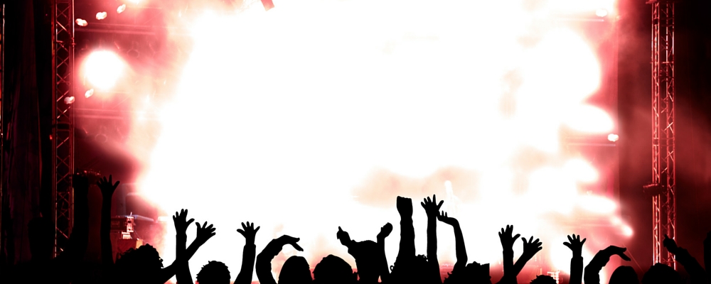
My personal preference is for live action shots of you or your band in action. Don’t just show the band though. If you can come up with a shot or two that show an audience actively “having fun” at one of your shows even better. You can get all “arty” with your photography but remember that you are trying to SELL your band and what you can do for the reader. If that’s a Booking Agent for example, you want to plant the idea in their mind that you can pull a crowd and entertain them.
Getting Help.
Many people think that the most cost efficient way of putting together a press kit is to do the whole thing themselves and, if you have the specific skills need, that can be so. But let’s face it. How many of you are not only good musicians but good copywriters, photographers and graphic artists? Not many I’ll bet. So what do you do if you aren’t good at those things? You get help of course. The problem is that this can become very expensive very quickly and that puts most musicians off immediately so you need to be very careful in what you farm out and what you do yourself. Even if budget is no object to you, there are certain parts of this process you should still do yourself or at least contribute to.
What should you do yourself?
In my opinion you should make every effort to supply as much of the content of your bio yourself. No-one knows your band or your act as well as you do and it needs to be written by someone who knows a bit about you if possible. I know from experience that the hardest bio to write is for a band you’ve never seen or met. Now, you might not be much of a writer and that’s fine. If all you can do is put together a list of words and phrases that accurately describe your act then you stand a much better chance of getting an effective and honest bio written. Ideally, you should write version 1 of your bio yourself then pass it on to a copywriter to work over if your budget permits.
What should you NOT do yourself?
Logos and other graphic work. Unless you actually have some genuine artistic skills then don’t even think about it. Same goes for photography! Get some help.
Where can I get some help?
Budget is your biggest factor here. If you have the cash then all you need to do is pick up the phone book or do a little googling and you are in business.
If your budget is tight then you need to be careful, press kits can easily cost many thousands of dollars! Start by writing as much of the copy as possible. Next start searching for friends, relatives, acquaintances, business associates or whoever you can approach on a personal level to help you out. You will be quite surprised when you start asking around. If you can find someone who is just starting out for themselves in business then they may even be willing to work on your press kit or photographs for a low cost in return for using you as a case-study or as part of their portfolio. I’ve done this for some of my clients. When I was just starting out doing websites I did some for free so I could build up a portfolio. You may be able to strike up the same arrangement for yourself if you ask!
Next you might want to consider contacting local photographic stores or clubs to find a semi-pro. Even community colleges or universities can be a source of enthusiastic semi-professionals who may be willing to work cheap. You don’t need to hire the best photographer or graphic artist in the world, sometimes a skilled semi-pro can do almost as good a job, certainly good enough for your needs.
The Big Contradiction.
This is the part where I get to contradict most of what I’ve written in the last three articles! We’ve talked about getting the best possible press kit and about getting help but the simple most important piece of advice I can give you is
“Don’t wait till you get it perfect, just get something passable done and get it out there!”
The simple fact is folks, that you probably don’t know what “perfect” means for you in terms of a press kit anyway. Most folks need to actually DO SOMETHING before they can get enough of a result to tell if it’s working. It’s really easy to get paralysed by trying to aim for the perfect product and to simply never get it finished. You have to find a balance between the perfect kit and actually doing something.
Step 1 should always be to get something out there and test the results. Keep what works and ditch what doesn’t. If your first attempt at a press kit actually gets you some work, which is likely if you put it in the right hands, then that work can help pay for some professional help down the track. Perfection is good, but it takes time, effort and money. Just do the best you can in the beginning and work on it continuously until you can afford to pass it on to a pro.
I hope that this series is helping you to take some action and get a start. If it has then it’s been worth it. Like always, if you have any questions or comments then please leave them below.
1 Comment
Leave a Comment
What our customers say about Premium Band Sites:

The Silverline
“We used Mark Gibson and Premium Band Sites to create the website for our duo The Silverline.

Rudy Miranda (Australian Session Drummer)
I found it very easy to convey my thoughts & ideas to Mark when creating my website.
He’s patient and a great communicator and goes out of his way to achieve a high quality and professional product for his customers.
I’m very pleased with the results and any technical issues have been quickly addressed and fixed.
If you’re looking to create a Professional Band or Musician Website, I would highly recommend you contact Mark Gibson @ Premium Band Sites today.”

Brad Marks
“When I decided I needed a new website I was pointed in the direction of Mark Gibson.
From the start, Mark was very proactive in making sure he knew exactly what I wanted from my website and I couldn’t have asked for a better end result. Mark is very friendly and happy to answer any questions and provide any advice he can. I highly recommend anyone looking to start a website to give him a call, you won’t be disappointed.”

Herm Kovac, Drummer TMG
“When TMG (Ted Mulry Gang) decided to hit the road again the first thing we had to do was get a website up and running and our socials
Mark Gibson from Premium Band Sites came highly recommended and in no time had our website created and up and running and we were happy from day one, didn’t change a thing.
When it came to a Facebook Campaign to push our gigs Mark was there to advise us and to get in place.
I highly recommend Mark to any band or solo artist. He knows his stuff but more

George Sich
“Mark,
Thank-you for my website, I could not be more pleased with the finished product. It looks fantastic on either computer, or mobile phone, and I love the functionality, especially the seamless interaction with the e-commerce site. Very well done, sir!”

Merilyn Steele
“I recently had a new website created by Mark Gibson and I’m so happy with it! I can manage my own updates, gigs, posts and news and it is so easy. Mark was so great to work with as well and charged a very reasonable fee too. Highly recommend him if you want a new site.”
[…] hope this small article on marketing for musicians was helpful to you. Next up, we will continue with some of the basic elements of formatting your Press Kit. If you have any questions or suggestions of your own I’d love to hear them. Just drop a comment […]